Design evidence · not a pitch
Four renders, and the tab bar that told on them.
These screens were generated from one written style card and one mascot reference image. Judged alone, each is convincing. Chained together as an app, they fall apart, and the place they fall apart first is the chrome that every screen is supposed to share.
01 — The set
Generated from a style card, not a template.
Each render got the same locked palette, type direction, and the Wobble reference image. No screenshots of competitors, no layout scaffolding, no hand-placed elements. The mascot stayed on-model across all three, and the growth chart arrived with a typical-range band and axes that read correctly. That part worked.
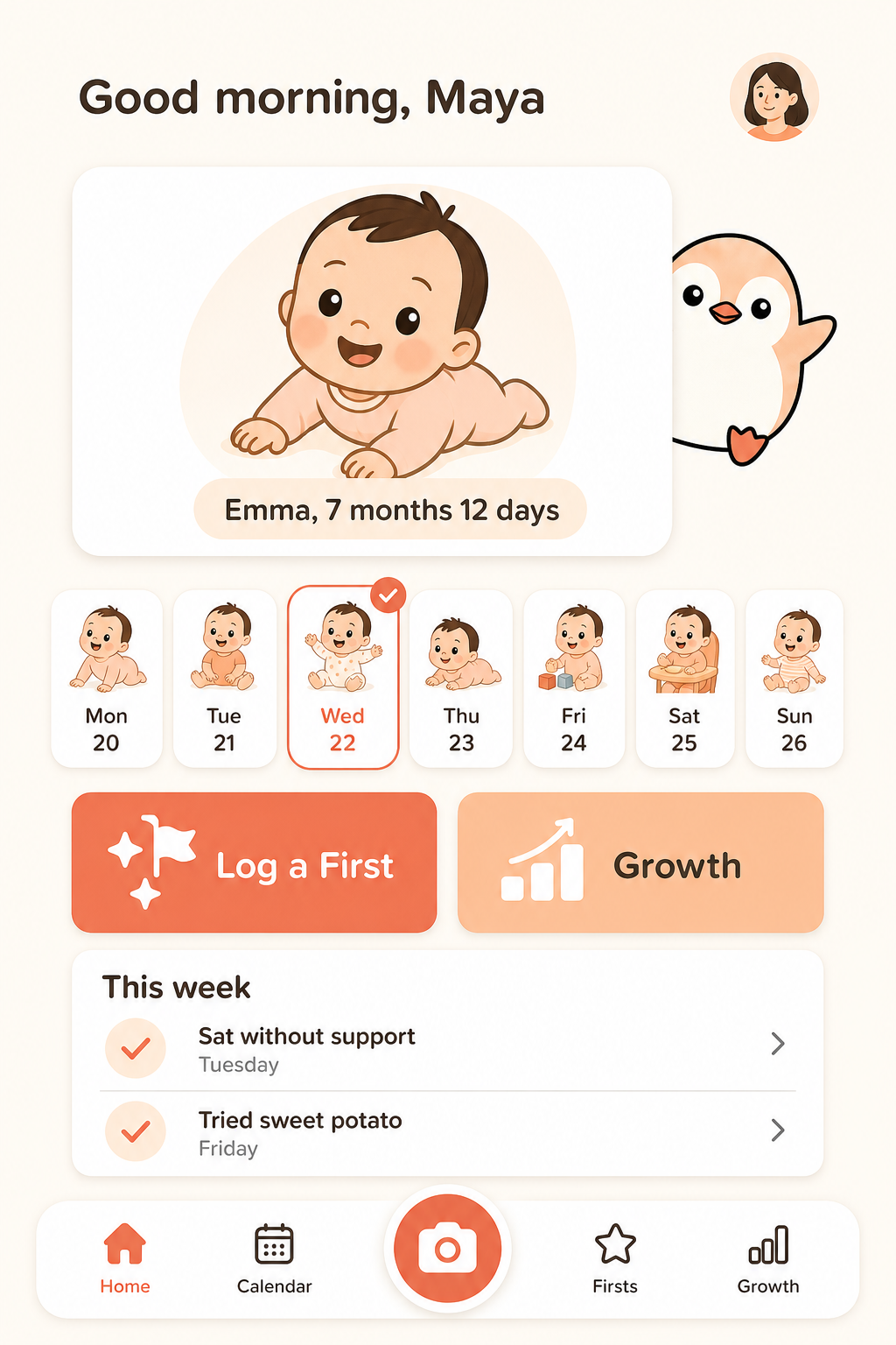
Home
Dense composition test. Hero card, week strip, paired action cards, and checkpoints all inside the first viewport.
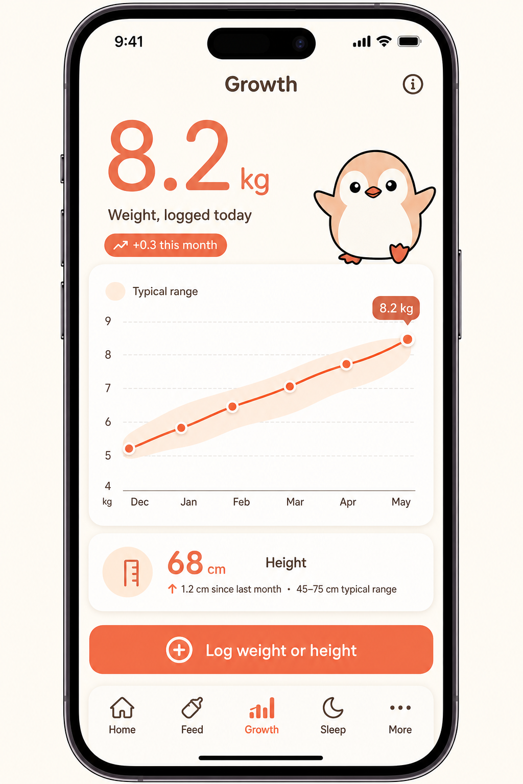
Growth
Data-visualisation test. Real curve, shaded typical range, entry dots, and a callout that agrees with the hero numeral. Note the phone bezel home never asked for.
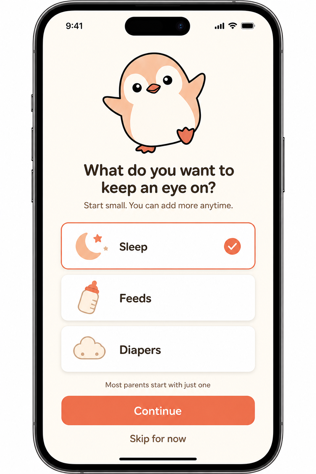
Onboarding
Mascot-in-layout test. Three categories, not thirteen, with a selected state and honest microcopy.
02 — The defect
Every render is painted fresh, so shared chrome drifts.
An image model has no memory of the last screen it made. Ask for a tab bar twice and you get two different tab bars. Below are the bottom strips of the first two renders, cropped from the originals and nothing else changed. Same app, same prompt style, same session.
Home render
Home · Calendar · camera · Firsts · Growth
5 items, centre action button
Growth render
Home · Feed · Growth · Sleep · More
different items, no centre button, invented
The growth prompt said only "tab bar at bottom", so the model designed one. It even guessed the tracking tabs the product would later need, which is flattering and completely useless: two screens of the same app cannot have two different navigations.
03 — The fix
Anchor the chrome the way you anchor the mascot.
Wobble stays on-model because his reference image is fed into every single generation. Screens get the same treatment: the first accepted screen becomes the chrome anchor, and every later render receives it as a second attached image with an explicit instruction to copy the navigation exactly. Re-rendered growth, anchored to home:
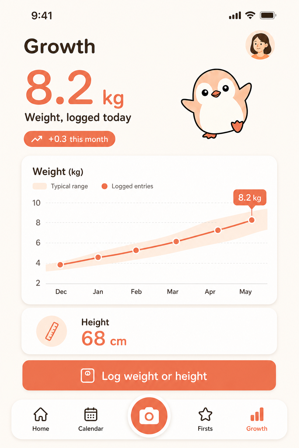
Growth · anchored
Same five tabs in the same order as home, correct active state on Growth, centre camera button restored.
Growth render · anchored
Home · Calendar · camera · Firsts · Growth
matches the anchor, Growth active
Name the chrome in the prompt
Tab items are written out every time. "Tab bar at bottom" is an invitation to invent one.
Attach the anchor image
The approved screen rides along with every later render. -i takes multiple files, so this costs nothing.
Build against components, not pictures
Anchoring fixed the navigation and the full-bleed framing, but the render still added a status bar the anchor does not have. Small drift survives, because every image is a fresh painting and nothing enforces sameness. In code the tab bar is one shared component, so there is only one tab bar that can exist. Renders carry taste. Components carry truth.
04 — The deeper defect
The tab bar was the symptom. The missing inventory was the disease.
Look again at the first set. Onboarding asks "Sleep, Feeds or Diapers?" and the home screen has nowhere to log any of them: it is photos, milestones and growth. Those two screens describe two different products. The prompts were written by hand from different sections of the spec, and nothing reconciled them, so the renders faithfully drew both apps.
The fix is not a better prompt. It is an artifact that did not exist: a screen inventory that fixes the tab set, maps every feature to a screen and its states, and names what is deliberately out of scope. Comps are then generated from the inventory rather than from improvisation. Same model, same style card, four screens:
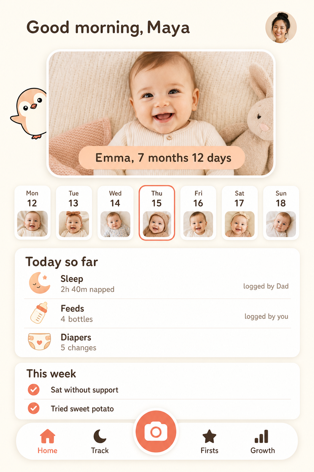
Home · the anchor
Now carries both layers: the photo hero and a "Today so far" summary showing sleep, feeds and diapers with who logged them.
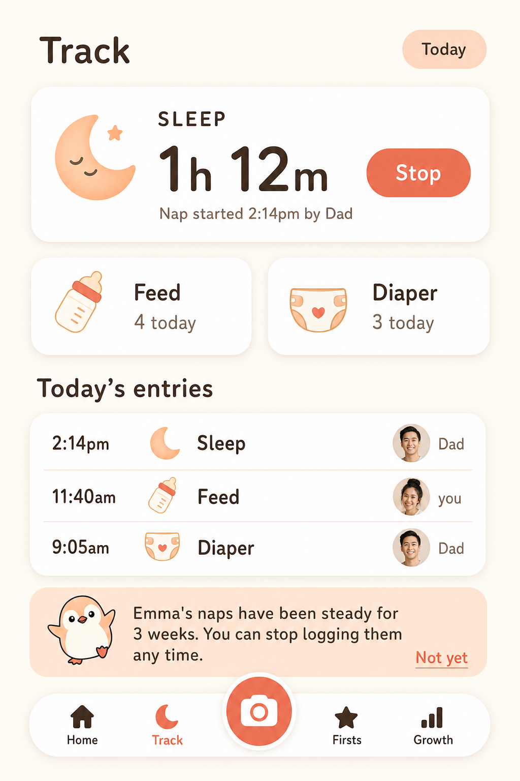
Track · the promise kept
What onboarding sold. Sleep as the spine, per-entry attribution, and the suggestion to stop logging once a pattern is stable.
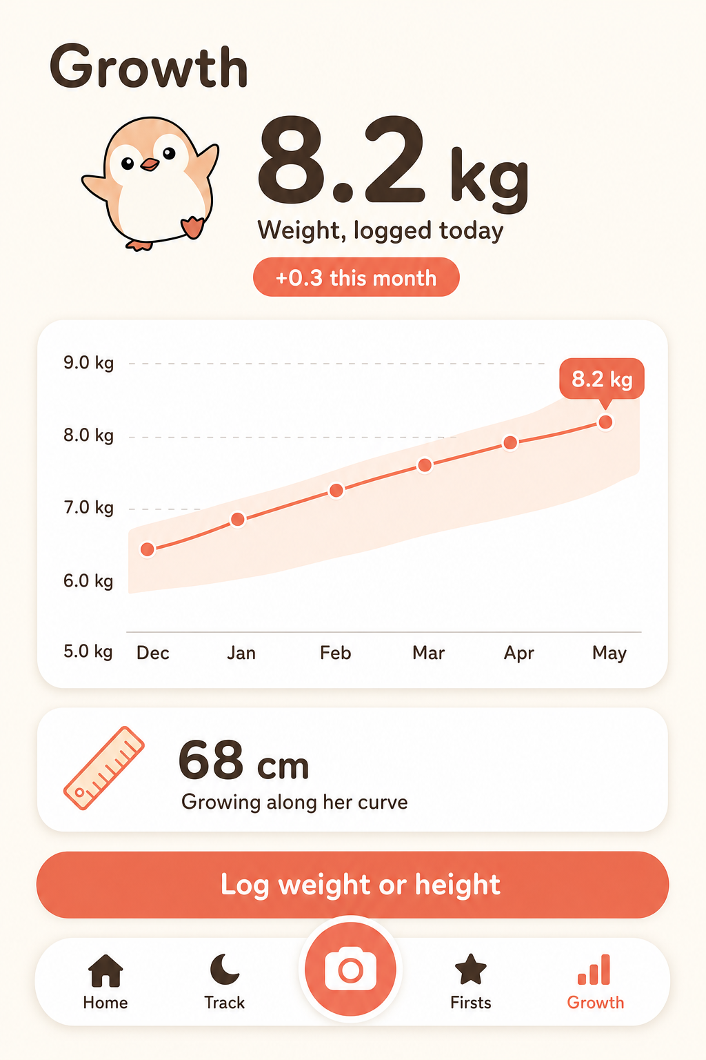
Growth
Same chrome, Growth active. Anchored to home rather than reinvented.
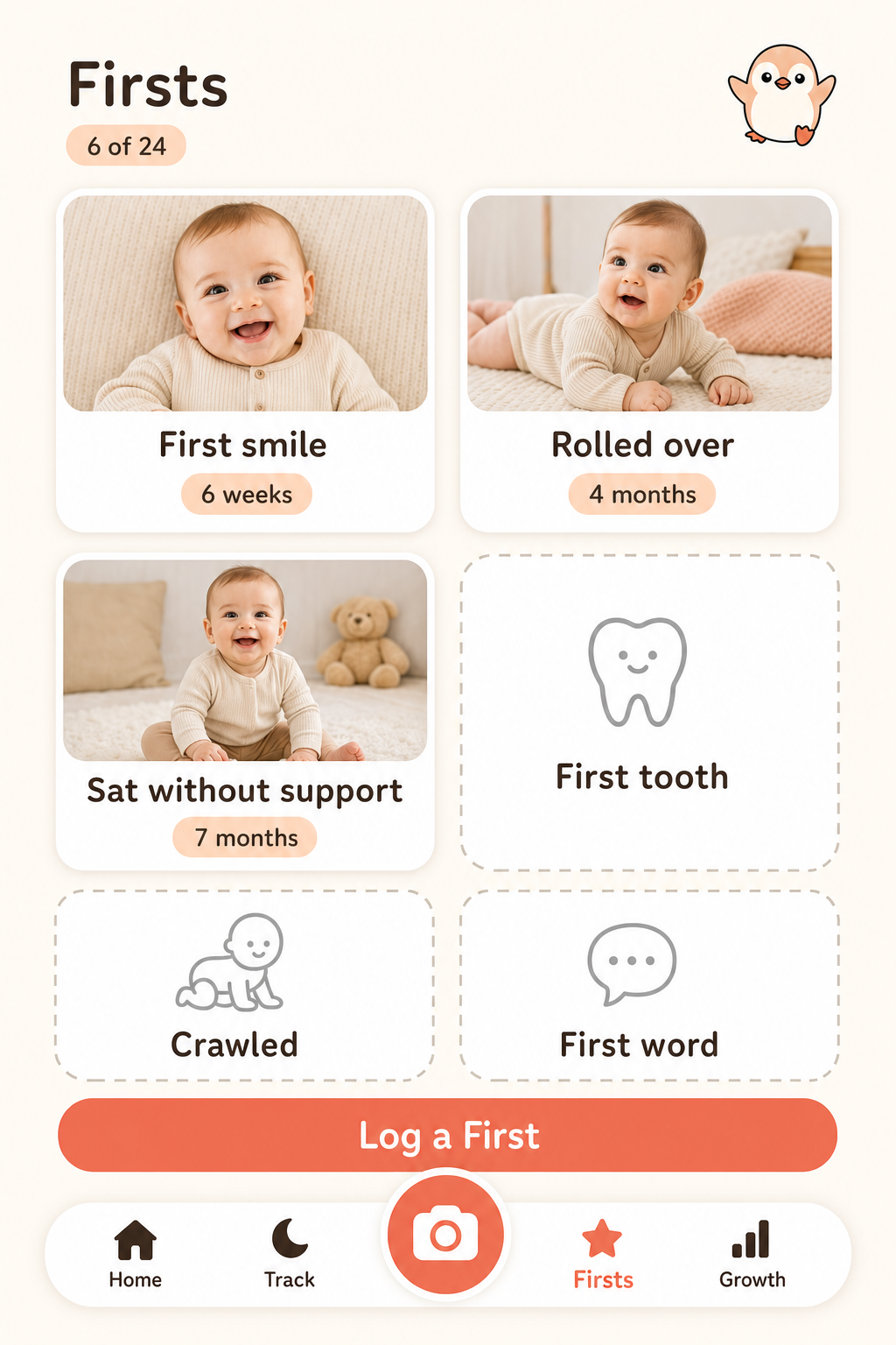
Firsts
Logged and unlogged states side by side, so the empty half of the grid reads as an invitation rather than a deficit.
Four screens, one navigation, and a parent who picks Sleep during onboarding now lands somewhere that serves it. But look at the numbers.
Diapers 5 changes
Diaper 3 today
Chrome drift is solved and data drift takes its place, because two images cannot share state. Only one thing fixes this, and it is the same answer as before: the screens must read from one set of fixtures, which is why fixtures are a required member of the design packet and why the gate compares every comp against them. An image can only ever be told what to say. A component reads.
05 — Honest status
What this page is and is not.
These are direction comps: they exist so a human can judge whether the app feels right before anyone writes a screen. They are not the specification. The growth render confidently labels a "45–75 cm typical range" for a seven-month-old, which is wrong, and no amount of prompting reliably fixes that class of error. Numbers come from the spec and the fixtures. Feel comes from here.